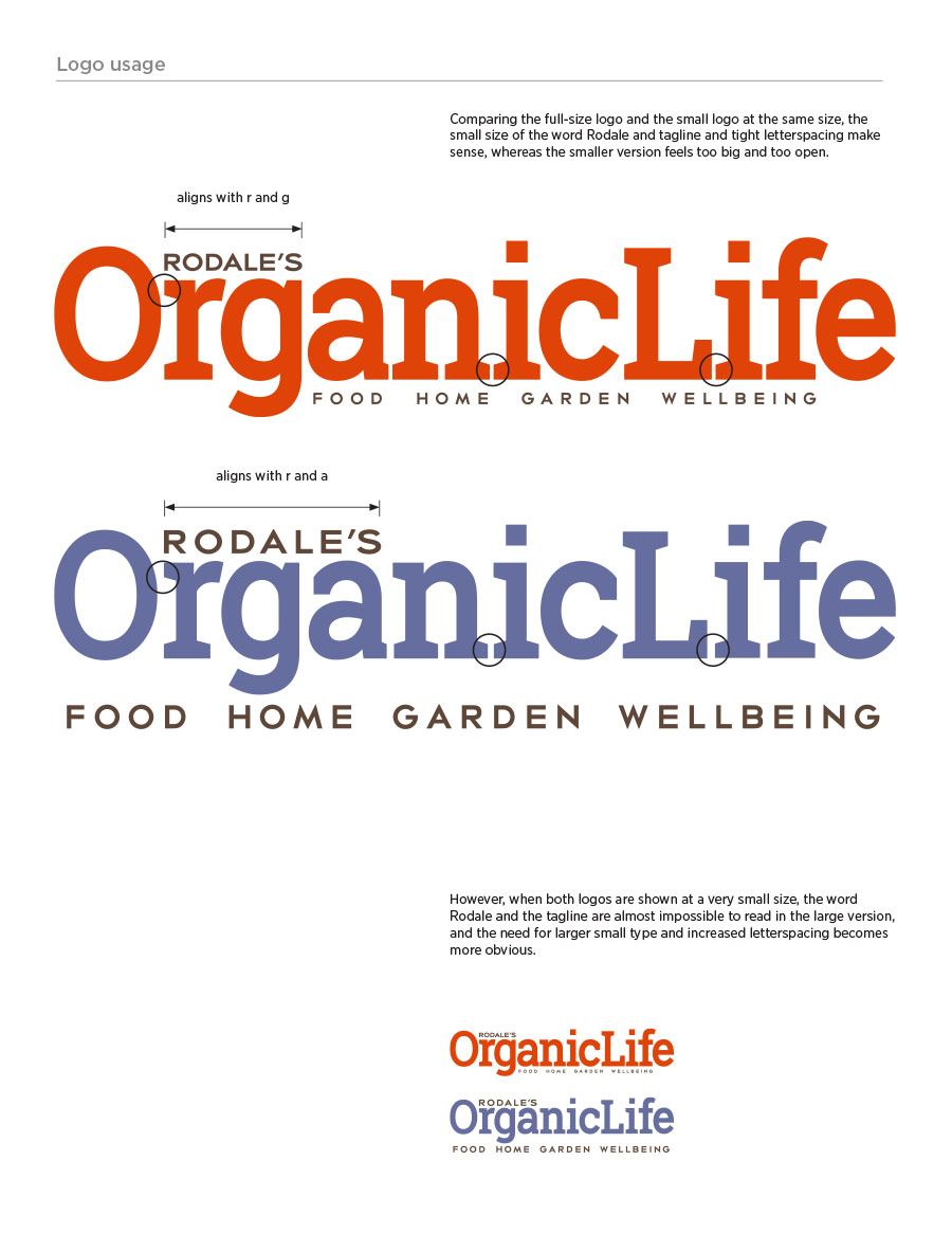
Brand Guide
With only four months to pull together marketing collateral for a brand that had yet to exist, the constantly developing brand guide helped streamline the creation of digital, print and experiential materials. There are over 30 pages, including typeface choices, color palette breakdowns, image choices and examples.


Online Media Kit
Created and published live in under three days, this single-page website utilized content developed for the sales deck and sell sheets (see below), and added interactive elements and SEO optimization.


Sales sheets
Also called Sell Sheets or One Sheets… developed to introduce the main content pillars, specification and contact details, specific upcoming content and customized category and advertiser programs.


Sales Deck
Like the media kit and sell sheets, the general presentation needed to get advertisers excited about a brand that wouldn’t exist for several months.


EDITORIAL WEBSITE Comp
Two months before the editorial website would be available, this homepage and Food category website comp gave the sales team the ability to show clients how the upcoming site might look and function. It was live for only a short time, but could be shown on an iPad and swiped through.


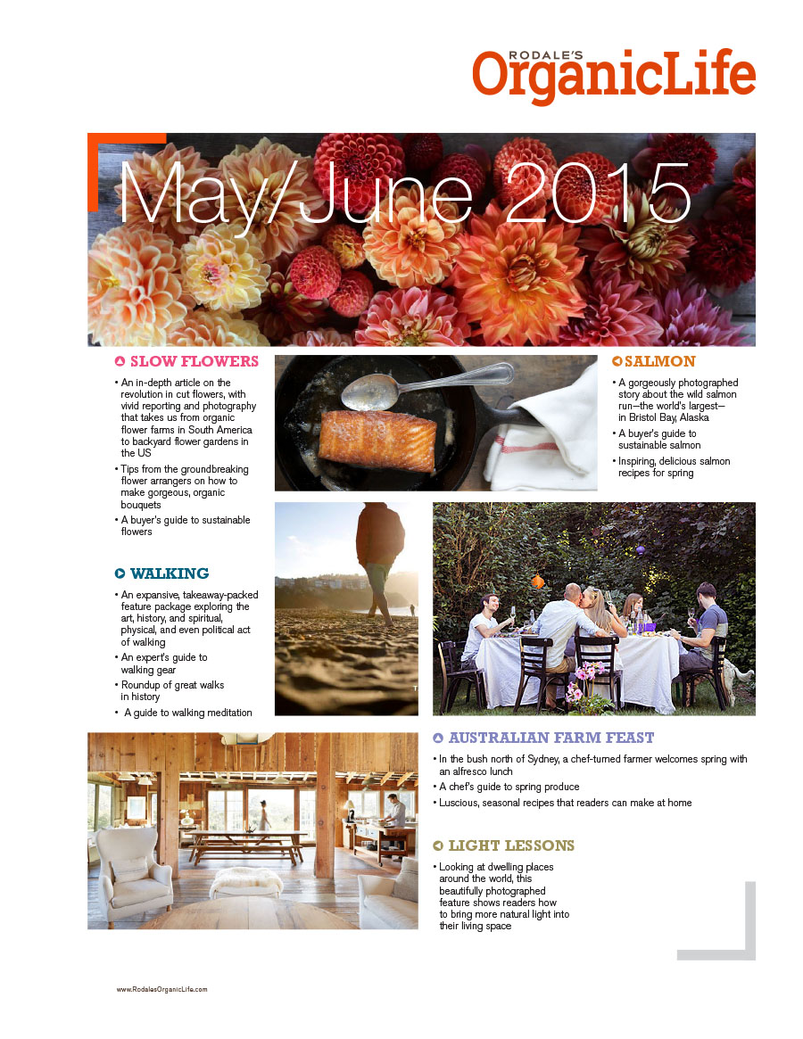
Editorial Contents page
Like the website, the sales team also needed a comp of the magazine’s contents pages ahead of time.


Design Notes
There were two teams working on developing materials at the same time, marketing and editorial. I was part of marketing, and initially developed our direction based on the editor’s mission statement. But as editorial shared details of their work I would grab anything design-related and incorporate it into the collateral we were developing, so that the brand output would always match.
Fonts
Berthold Akzidenz Grotesk, Rockwell, Helvetica Neue.
Color palette

Software
Adobe InDesign, Photoshop, Illustrator.


